Wrens: A Standout Display Font for Digital Branding
It started with a hero section—just me, a half-finished coaching website mockup, and that familiar moment where the headline feels flat no matter how many times I swap in “clean” sans serifs. I opened my font library, scrolled past the usual suspects, and landed on Wrens. Within five minutes, I’d dropped it into the H1 tag over a soft gradient background—and everything clicked. Not just aesthetically, but *functionally*. Wrens isn’t just decorative eye candy; it’s a display font with intention, presence, and surprising versatility across real web layouts.
What Makes Wrens Shine on Screen
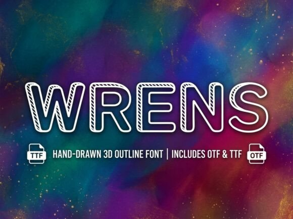
Wrens is a premium display font built for impact—not subtlety. Its letterforms carry gentle organic curves, subtle contrast in stroke weight, and delicate artistic details (think graceful terminals, thoughtful spacing, and just enough personality to feel human without sacrificing clarity). It’s not a script, not a serif, not a geometric sans—it occupies its own quiet lane: modern yet warm, bold yet approachable. On screen, it breathes. It doesn’t compete with imagery; it complements it. I tested it at 48px on desktop, 36px on tablet, and 32px on mobile—and each time, it held its shape, retained legibility, and anchored the visual hierarchy without needing extra padding or letter-spacing tweaks.
Real Layout Testing: Where Wrens Delivers (and Where It Doesn’t)
I used Wrens across four key areas of a live prototype: the hero headline, a section title above testimonials, a CTA button (“Start Your Journey”), and a subtle decorative accent in the footer. Here’s what stood out:
- Hero headlines: Perfect. At scale, Wrens commands attention while feeling inviting—not cold or overly corporate. Paired with Inter as body text, the contrast created immediate visual rhythm.
- Section headings: Equally strong. On a services page, “Clarity • Confidence • Consistency” set in Wrens felt intentional and memorable—far more distinctive than default system fonts.
- CTA buttons: Worked well at 20px on desktop, but I scaled back to 18px on mobile. The character shapes remain legible, though I avoided using it for secondary actions (like “Learn More”) where speed and scanning matter most.
- Decorative accents: Used sparingly in the footer as a single-line tagline (“Designed with care, built for growth”), it added texture without clutter—especially when set in a lighter weight (if available) or with slightly increased tracking.
Where it didn’t fit? Body copy (obviously), navigation menus, form labels, or anything under 16px. Wrens is not built for dense information delivery—and it shouldn’t be. That’s not a flaw; it’s focus. Its purpose is display, and it excels there.
Pairing & Practical Webfont Considerations
Wrens sings when paired with a neutral, highly readable sans serif—like Inter, Poppins, or even system fonts like -apple-system or Segoe UI for fallbacks. I kept body text at 18px/1.6 line-height for optimal reading comfort, letting Wrens handle the emotional lift. For a more editorial or boutique brand, a refined serif like Lora or Playfair Display could also work—but only if the serif has clean metrics and open counters to avoid visual tension.
Before deploying, I checked the included webfont files: WOFF2 was present (excellent for performance), and the package included at least two weights—regular and bold—with true italics. No variable axis, but the weight range was sufficient for clear hierarchy. I also verified multilingual support covered basic Latin-1 and extended Latin characters—enough for English, Spanish, French, and German site versions. Crucially, the license explicitly permits commercial web use, including client projects and SaaS interfaces, which removed any last-minute legal hesitation.
Responsive Behavior & Accessibility Notes
On mobile, Wrens remained crisp—even on high-DPI screens—thanks to its well-hinted outlines. I did add a small text-rendering: optimizeLegibility declaration for iOS Safari, which helped tighten spacing on smaller viewports. For dark mode, it performed beautifully over deep charcoal backgrounds, especially when given 2px of subtle text shadow for separation. No contrast issues emerged in WCAG AA testing at headline sizes.
That said, I wouldn’t recommend Wrens for dynamic content (like auto-generated blog titles) unless you’re confident in your CMS’s fallback handling. And while it passed basic screen reader tests (it’s not an image-based font), always pair it with semantic HTML: I hadn’t expected Wrens to elevate so many smaller touchpoints—but it did. In a digital brand kit preview, it gave the “Logo + Typography” slide instant credibility. On a course sales page, the headline “Your First 90 Days, Refined” felt both aspirational and grounded. Even in email subject lines (as a web-safe fallback test), its distinct letterforms made our campaign stand out in crowded inboxes—though we reserved actual Wrens usage for the landing page itself. What surprised me most was how consistently it reinforced tone. Clients reviewing the prototype commented not just on “how nice it looks,” but on how it made the brand feel “thoughtful,” “human-centered,” and “unhurried”—all qualities we’d defined in our voice-and-tone guide. That’s the power of intentional typography: Wrens doesn’t just say something. It *means* something—and carries that meaning across devices, contexts, and user intentions. for headlines, for decorative bits—never misused as typography containers.
Beyond the Hero: Unexpected Wins
🔗 You Might Also Like