Ekram: A Display Font That Earns Its Space
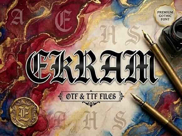
First glance at Ekram tells you it’s not background noise—it’s a statement. There’s weight, rhythm, and quiet confidence in its letterforms. The serifs are sharp but not aggressive; the contrast between thick and thin strokes feels intentional, not arbitrary. It’s neither nostalgic nor futuristic—it occupies a grounded, contemporary space where craftsmanship meets clarity. As a display font, Ekram doesn’t shout. It commands attention by holding it—through balance, proportion, and subtle personality.
Where Ekram Naturally Lives in Real Projects
Ekram thrives where visual impact matters more than paragraph flow. In logo design, it anchors brand marks with authority—especially for studios, publishers, artisanal brands, or premium lifestyle labels. Its uppercase forms carry gravitas without stiffness; lowercase letters add just enough warmth to avoid coldness. I’ve used Ekram successfully on product labels for small-batch ceramics and natural skincare lines—its presence signals care, intention, and quiet luxury.
For packaging design, Ekram shines on front panels and secondary branding elements. It pairs beautifully with uncoated paper stocks and minimalist layouts. On merchandise—think tote bags, enamel pins, or limited-run posters—it reads cleanly even at medium sizes, provided spacing is respected. In editorial design, it works as section headers or pull quotes—not body text, never body text—but as punctuation that gives rhythm to long-form storytelling.
In web design and social media graphics, Ekram performs best above the fold: hero headers, announcement banners, and Instagram carousel titles. It holds up well in digital ads when exported as crisp vector or high-res PNG—just avoid stretching or overly tight tracking. For printable design like wedding invitations or boutique business cards, Ekram adds tactile sophistication, especially when paired with thoughtful kerning and generous line height.
Where to Use Ekram—And Where to Pause
Ekram is strongest in short bursts: brand names, taglines, chapter titles, callouts, and decorative accents. It’s not built for dense UI text, navigation menus, or captions under 16px. Its display nature means it needs breathing room—tight leading or cramped containers dull its voice. Avoid using it for supporting text in Canva templates or Cricut projects unless you’re intentionally leaning into bold, graphic contrast.
I’ve seen Ekram misapplied in blog graphics where designers tried to force it into subhead roles meant for sans serif fonts—resulting in visual fatigue. It also doesn’t soften well in all-caps settings without careful letter-spacing adjustments. When used for quotes or testimonials, it elevates tone—but only if the surrounding typography supports it, rather than competes.
How Ekram Shapes Perception—and Why That Matters
Readability isn’t Ekram’s primary job—it’s recognition. At a glance, it conveys seriousness, refinement, and human-scale precision. That directly influences audience trust, especially for service-based brands or premium digital products. When Ekram appears consistently across touchpoints—website headers, email subject lines, printed catalogs—it reinforces brand consistency not through repetition alone, but through tonal cohesion.
Engagement rises when typography aligns with message intent. Ekram doesn’t invite casual scrolling—it invites pause. That makes it powerful for campaigns centered on reflection, craft, legacy, or elevated experience. But it won’t suit playful, fast-paced, or youth-driven messaging unless deliberately juxtaposed with contrasting type (more on pairing below).
Practical Designer Notes You’ll Actually Use
- Test Ekram in black and white first—color can mask spacing issues or awkward glyph relationships.
- Check readability at real-world sizes: 24px on screen, 8pt on print. If counters feel closed or stems merge, scale up or adjust tracking.
- Always try it on mockups—not just in Figma or Illustrator previews. Print a label, paste it on a product box, view it on a phone screen.
- Compare uppercase vs. lowercase usage. Ekram’s caps have stronger presence, but its lowercase has nuanced charm—don’t default to all-caps without reason.
- Review spacing carefully. Default metrics work well for headlines, but tighter tracking may be needed for short logos; looser for quotes.
- Pair it thoughtfully: beside a neutral sans serif (like Inter or Poppins) for balance, a warm serif (like Lora) for layered elegance, or a restrained script font for contrast—not competition.
- Avoid pairing Ekram with other display fonts unless one clearly yields hierarchy. Two strong voices cancel each other out.
- Confirm commercial licensing before use in client work, digital products, or resale assets. Ekram is a premium font—its value includes legal clarity for business use.
Final Judgment: Not Every Project Needs Ekram—But the Right One Will Feel Incomplete Without It
Ekram isn’t versatile in the way a workhorse sans serif is. It’s selective. It asks for context, intention, and restraint. That’s its strength—not its limitation. When used where it belongs—in logo design, packaging design, editorial headers, social media graphics, and premium printable design—it doesn’t just look good. It deepens meaning.
It reminds me of a well-tailored jacket: understated until you notice the stitching, the drape, the way it shifts perception without effort. That’s modern typography at its most effective. Ekram earns its place—not by being everywhere, but by being unforgettable where it counts.
If your project hinges on credibility, craft, or quiet distinction, Ekram isn’t just an option. It’s a deliberate choice—one that signals you understand how type shapes not just layout, but legacy.